For the past year or so, I’ve been begrudgingly bouncing from app to app for Twitter — The official Twitter app, Twittelator, and Twitterrific to name a few. Each had their own separate issues: The official app is frequently buggy and crashes in addition to having an odd user interface. Twittelator looks unpolished and Twitterrific has no option to specifically search for users. Tweetbot, on the other hand, is beautifully designed, uncluttered, is fluid to use and has all of the features you’d ever in a Twitter client. One of the first things I noticed is that most pictures appear in the timeline. This is an improvement from the previous version of TweetBot for iPhone, as I’ve always found it difficult to properly tap on the link to a photo. I’d always end up accidentally tapping on the tweet itself instead. This has been improved in the 2.0 update for iPhone too.
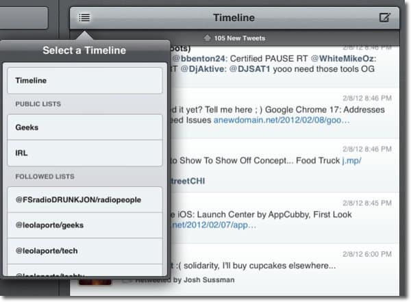
To look at a list, tap on the icon at the top left of the timeline view. This replaces the timeline with the list you select.
There are plenty of aspects to customize about the timeline, too. You can change font size, user’s display names, the format in which dates are shown and more.
Another added feature to TweetBot is Readability support. Readability removes the clutter surrounding that article you’re reading on a website a friend shared with you. Check out this photo of an article from TechCrunch someone linked to without Readability turned on.
Here’s that same article with Readability turned on.
Turn on Readability in TweetBot using the toggle switch at the top of the page viewer.
If you’ve used TweetBot’s iPhone counterpart, you’re already aware of how the gestures and taps work. Double tapping a tweet will single out that tweet and show more detail and options.
Triple tapping on a tweet, by default, gives you options to reply. You can change this behavior in settings, though. You can choose to have the triple tap Retweet, Favorite, Translate or View in Favstar instead.
Swiping from left to right on a tweet reveals the conversation view.
Swiping the other direction, right to left reveals all of the replies to a tweet.
If you can’t remember the gestures, tap once on a tweet to reveal a menu of options without leaving the timeline. Tapping on actions shows even more.
Another great feature to the timeline is this notification of how many new tweets have come in while you’ve been browsing. TweetBot updates automatically every five minutes unless you manually refresh. Don’t like the New Tweets notification bar? You can make it less persistent in Settings.
While all these different timeline views are taking place on the right side of the iPad screen, the navigation menu is on the left. In landscape mode it appears with full text labels.
In portrait mode the navigation menu appears condensed with only the icons showing to leave more room for tweets.
Composing a new tweet is similar to the iPhone version.
To mention another Twitter user, either type the @ symbol or tap the profile icon. Then begin typing their name or username. TweetBot automatically dwindles down the possibilities so all you have to do is tap the username.
It works the same way for hashtags as well. Either tap the tag icon, or type the hashtag symbol and just start typing. Tapping the camera icon gives you options to either pull in a photo from your library or let you take a new one. Here’s a look at Direct Messages in TweetBot for iPad. Tapbots made some refinements here too since the prior iPhone version.
Tapbot’s TweetBot app is hands down the best Twitter client I’ve used on both the Apple iPhone and iPad. Where every other app has fallen short in some way, TweetBot excels. I really get the sense that every detail has been thought of here. It’s often the small, yet important features that make or break a Twitter client for me. For instance, Twitterrific would have gotten my vote, except for the fact that you can’t search people, only subjects. While TweetBot for iPad is as close to perfect as it gets, there is still one thing that’s slightly inconvenient — Composing Direct Messages. It’s not intuitive for starting a direct message with another user. You have to go to first go to that user’s profile (which takes multiple taps depending on how you do it) and tap what looks like a reply arrow and choose Direct Message from there. Since direct messaging isn’t a very common practice, it’s not a deal breaker. If you’re looking for a Twitter client for iPhone or iPad that’s straightforward, gorgeous in design, liquid smooth in performance and doesn’t leave out important features or details, TweetBot is definitely the app to choose. It comes with a slightly higher price tag than most Twitter apps, though, but once you get your hands on it you’ll discover that it’s well worth that cost. Tweetbot is $1.99 for iPhone and $2.99 for iPad in the Apple App Store. Comment Name * Email *
Δ Save my name and email and send me emails as new comments are made to this post.


