Microsoft introduced a new design language called Project NEON in order to add more transparency and blur animations to the interface of Universal apps. This design language is focused on simplicity and interesting new animations. Some people are also calling this new look “Metro 2.0” which refers to the Modern look of the Windows UI that started in Windows 8. It adds a Windows 7 Aero Glass-like effect to Universal apps, too. Microsoft rolled out a UI refresh on Groove Music and Movies & TV last month which appears to be using these new visuals. In the latest Windows 10 Insider Preview Build 16188, codenamed Redstone 3, and the next major update coming to Windows 10, we get an early look at what is coming soon to a PC near you. For Groove Music you can see the translucency and blur on the sidebar with your playlists.
Although the NEON effect doesn’t stand out as much in the Movies & TV app if you look closely you can see it on the title bar.
Windows 10 Project NEON Apps
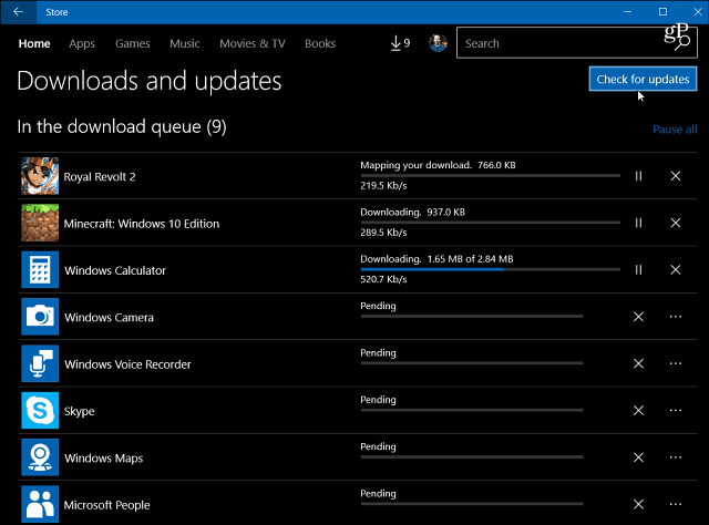
To check out the latest apps with the project NEON interface make sure you’re an Insider in the Fast Ring and your apps are up-to-date. If you’ve been running the latest build the apps should update automatically in the background, but if you want to stay on top of things, you can manually check for app updates from the Windows Store.
Here’s a look at the apps that have been updated with Project NEON design over the past few days. Starting with the simple but classic Calculator app. You can see it has more transparency and blur.
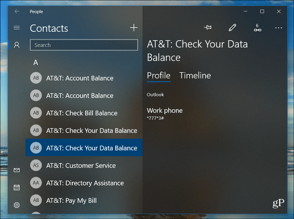
The People app, which was added back to Windows 10 with Insider Preview Build 16184 has been updated to include the NEON guidelines with transparency and blur.
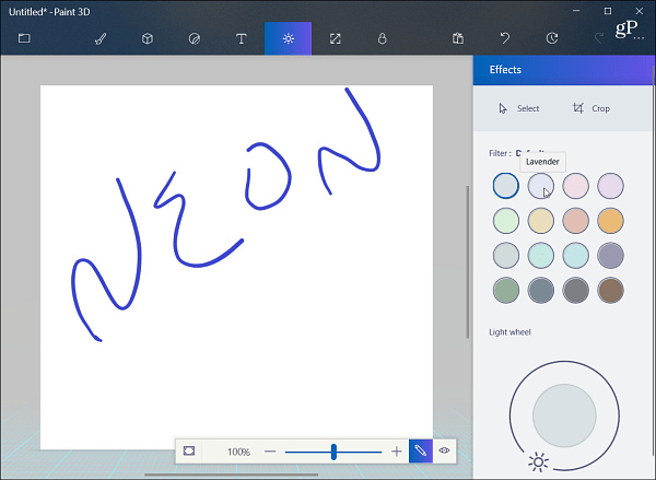
Here is what the Paint 3D user interface NEON refresh looks like.
The Photos app’s appearance is updated. Like the Groove Music and Movies & TV apps, the effect doesn’t jump off the screen but is noticeable with the “frosty-glass” look.
It appears that this is just the beginning and as we get closer to the launch of Windows 10 Redstone 3 (expected sometime this fall) several more apps will include the Project NEON design. This has the potential to change the entire Windows 10 experience moving forward. Update: During this year’s Build Developer Conference Microsoft announced that the official name of Project NEON is now called ‘Microsoft Fluent Design Design System’. Check out the following video to see it in more detail.
What’s your take? Do you like the changes of the UI that you’re seeing? Leave a comment below and let us know your thoughts. Comment Name * Email *
Δ Save my name and email and send me emails as new comments are made to this post.


